Landing page for the internal design system site
Our challenge was to ensure a consistent experience for our users across our UI for 26 existing products. By 2019 year-end we successfully defined component groups and page patterns, released one page pattern and continued to improve adoption across the enterprise.
Value Created
Developed a system that ensures a consistent user experience across applications to maintain user expectations
Created processes allowing for adaptive growth and ease of documentation between the different products and the design system
Implemented a complimentary mobile design system
Guided documentation and thinking around reusable patterns at component group and page levels
Recruited new product owner and UX to elevate the design system
Team
5 Designers
11 Developers
6 Person Leadership Team
Tools
Asana
XD
Azure Dev Ops
Storybook
Role
Lead Experience Designer
Product Owner
Skills
Leadership
Design Direction
Documentation
Collaboration
Systems Thinking
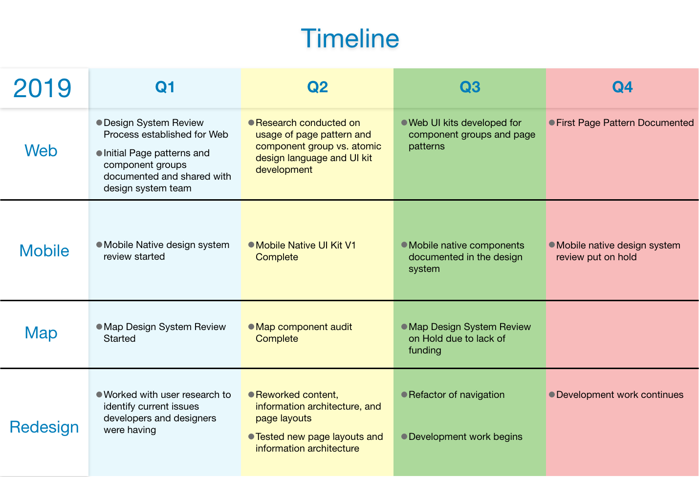
Loose Timeline of events in 2019
The Story
I came into a leadership role for the design system in late 2018 and took over product ownership from spring to fall 2019.
We had components documented but lacked a clear review process for new web, mobile, and map components, and a way to ensure pattern consistency.
Below is an example of an autocomplete component documentation and our Web UI kit.
Process Improvements
After identifying the gaps listed above, I focused on process improvements.
I set up a transparent review process for designers to add to the design system and created a group to define and document mobile and map components.
I took on the mobile native effort and delegated the map component documentation to another leadership team member.
Below are examples of the boards that were set up as part of the process for mobile native, web, and map component reviews.
Expanding the Design System Thinking
After I established review processes, I shifted my focus to ensuring pattern consistency across applications.
The team and I started investigating other enterprise design systems, including GE, Salesforce, IBM, and SAP, to see how they handled pattern documentation and use design systems.
While our analysis of these design systems provided some guidelines, around documentation, presentation, content, and organization, it did not fully address the challenges of our relatively digitally immature organization.
In order to determine a more appropriate solution for our unique challenges, we returned to the structural principles of atomic design.
Copyright Brad Frost I am using this image for educational principles only
After an in-depth discovery phase, we decided to apply Atomic Design as a best-fit approach because:
The components fit into the framework reducing rework
It provided a way of thinking about enterprise software as a complex series of patterns
It helped use us define, identify, and categorize multiple levels of patterns
Ultimately, we recognized it would help meet our goals of achieving consistency in our products.
Next, the team investigated if the Atomic naming standards (atom, molecule, etc.) were salient to our end users (internal designers and developers) and I went to validate emergent complex patterns, such as pages.
Above are some examples of patterns I identified and documented with my investigation.
I began my research by having product teams send me their design files then sorting and categorizing them by purpose and form.
This resulted in a list of common page “templates” and “organisms.”
Page templates included: Search, Task List, Details, Forms, Rules;
Organisms included: Filter, Advance Search, Panel Table, page header, page footer, and pseudocode rule panel.
I circled back with the team and we shared our results.
They found that Components, Component Groups, and Page Patterns were more meaningful naming conventions to our end users.
Given their results, I relabeled my findings to meet their naming conventions.
Page templates became Page Patterns and Organism became component groups.
As of today, we released one documented page pattern (pictured below) with more component groups and page patterns on the way.
Mobile Native Design System
When we started the mobile native component review we had three applications that had recently been redone but lacked any consistency in development and design.
In our first review meeting, I worked with the team to take the current applications and document our common components.
Using this list as a backlog, I assigned team members a component and asked them to take instances from each application, document differences, and propose a unified single component.
By May 2019, we completed our first iteration of the components, documented style, and usage in a UI Kit for designs, and engaged the Mobile and design system teams to begin formal documentation and build the components.
Next Phase
For the next phase, I recruited design system expert Eli Schiff to continue to lead the thinking on our design system.
In 2020 our plan is to:
Continue releasing page patterns, component groups
Adding interaction patterns into the design system
Formally launch the mobile native design system
Formally document content standards
Deploy a screen crawler to check products for design system compliance
Thank you
I want to say thank you to all of the design system and leadership team. I love your passion and thorough approach to your work every day and you are really driving our organization’s digital transformation.


